


When the homeowners purchased the house, it was obvious that it had been lovingly kept by the previous owners. The house had "great bones", but it was ready to be personalized for it's new owners. The homeowners had done their homework and really knew the look they wanted. It was important to bring as much light as possible into the house because their lot is heavily wooded. We also wanted to add more architectural interest to the interior of the home, so we used moldings and wainscotings throughout.
Here's what the home looked like before we started construction. All before photos are quick screen shots from the MLS listing (HAR.com) when the house was on the market.
The staircase was already beautiful, but we wanted to make it really special. Also, you'll see how small the doorway under the stairs looks compared to the larger opening to the formal living. Same for the other doorway in the dining room.
Visually it didn't look right, and it made these openings feel cramped.
.png)
%2B-%2BCopy.png)
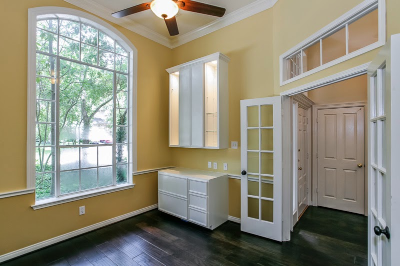
The study is located off of the foyer. I loved the transom window above the French doors, but the interior "window" with shutters looked awkward and out of place. We decided it was best to close it up to add more privacy to the study and the formal living room.
.png)
Here's another shot of the study. It has a huge front window that is almost two stories tall and allows beautiful light into the room.
.png)
.png)
.png)
%2B-%2BCopy.png)
.png)

And this photo shows the family room side wall, with long and narrow windows. Great for privacy from neighbors, but awkwardly placed. They just seem to get lost on that wall. This was important to me, because from the kitchen, this wall is the main view so I knew we had to dress it up.

%2B-%2BCopy.png)
%2B-%2BCopy.png)


The study was painted in the homeowners favorite sunny shade. She will really enjoy the view from that beautiful window while she works. And we added custom built-ins for added function. They were designed to hide clutter behind the doors, but display sweet things from her little ones on the lighted glass shelves. We also installed outlets above the counter space to minimize the mess that cords can create.

We debated on what to do with the old hardwoods and considered having them refurbished, but in the end going with new hardwoods was the right choice and it really transformed the entire first floor. The living room received a full makeover as well, with those beautiful wide plank floors, paint, tons of molding, and recessed lighting. I love that the homeowners chose this room as their own "kid free" space to enjoy in the evenings.


You can see the difference that installing the third window made. We had to remove brick from the exterior of the house, but the room looks twice as big now.


The cabinets were beautifully painted in a soft white with an espresso glaze. New appliances were installed - there was even room to add a double oven. We removed the track lighting and replaced it with decorative pendant lights and additional recessed lights. I love the breakfast nook with the bead board wainscoting and window casing. This is definitely the perfect spot for morning coffee!

The dining room is on the opposite side of the foyer and also has beautiful windows. The wallpaper drapes and chandelier were dated and ready for something new.
The formal living room is just beyond the study. The homeowners wanted to use this space as a quiet place to unwind in the evenings with a good book. The carpet was in good shape, but new wide plank, dark hardwoods were on the list for the entire first floor.
The family room is open to the kitchen and breakfast room. I love this concept so much because it's so "family friendly". We knew this was a really important space because it's where the family would spend most of their time together.
The existing family room windows were set to the corner of the room. We wanted to balance out the wall and bring in more light, so these windows were removed. We installed new ones and added a third window to the wall.
This iPhone photo shows the same view once the room was emptied. That wall just didn't look right for the room.
And this photo shows the family room side wall, with long and narrow windows. Great for privacy from neighbors, but awkwardly placed. They just seem to get lost on that wall. This was important to me, because from the kitchen, this wall is the main view so I knew we had to dress it up.
Amazing what a little masking tape can do for a room :)
The kitchen already had beautiful solid wood cabinets. But we wanted to make the space brighter, lighter, and updated. The walls were covered in a venetian plaster finish which we weren't to crazy about so that needed to go. The granite was recently added by the previous homeowners, and although it wasn't what the new homeowners would have picked, we needed to keep it in our design plan. I actually love working with elements like this. Things you wouldn't necessarily pick for yourself, but making them work with your home. It doesn't have to compromise the other selections, and It's always a nice surprise to see how well it can all come together!
And now for the after...Come on in!
The walls were painted in a soft cream. I often recommend interior paint with a flat finish because it looks so velvety to the eye. It also does a great job making wall texture and imperfections less noticeable. And if you go with a good quality base paint - it's durable enough for spot cleaning. Don't let anyone tell you different, flat paint is
kid friendly and I prefer it to all other finishes!
Everything got an upgrade! Wainscoting and crown molding was added to the staircase, landing and dining room. We updated the light fixtures (love this lantern in the foyer!), and the contractor added a solar tube light in the upstairs landing. Such an incredible feature. The once dark landing is now flooded with natural light during the day. You'll also see how we enlarged the doorway under the stairs making it more inviting and open.
The stairs were updated with iron spindles and a coat of dark stain.
The study was painted in the homeowners favorite sunny shade. She will really enjoy the view from that beautiful window while she works. And we added custom built-ins for added function. They were designed to hide clutter behind the doors, but display sweet things from her little ones on the lighted glass shelves. We also installed outlets above the counter space to minimize the mess that cords can create.
We added trim to the windows throughout the home. This is such a cost effective way of adding architectural interest, and is something you can do as a DIY project. Our contractor really tied it all in nicely with the crown molding and wainscoting. This dining room was ready to shed all of that wallpaper and received a soft green paint with just a hint of gray.
We debated on what to do with the old hardwoods and considered having them refurbished, but in the end going with new hardwoods was the right choice and it really transformed the entire first floor. The living room received a full makeover as well, with those beautiful wide plank floors, paint, tons of molding, and recessed lighting. I love that the homeowners chose this room as their own "kid free" space to enjoy in the evenings.
And remember the dark and drab family room? No more! I loved that the homeowners were ready for color. I tend to lean towards neutrals, but after this project I was ready for a little more color in my own house! This color is actually a deep paprika, and isn't as orange as it appears in this photo. It's such a warm and cozy color. We could be bold with color because we had so much white in the moldings to balance it all out. I especially love the wall of wainscoting. Now the transom windows look like they belonged there all along.
You can see the difference that installing the third window made. We had to remove brick from the exterior of the house, but the room looks twice as big now.
And here's the kitchen! Those counters belonged here all along and I'm so glad we didn't replace them. This granite has undertones of clay and slate blue. I used that as inspiration for the wall color and the new travertine and glass tile backsplash.
The cabinets were beautifully painted in a soft white with an espresso glaze. New appliances were installed - there was even room to add a double oven. We removed the track lighting and replaced it with decorative pendant lights and additional recessed lights. I love the breakfast nook with the bead board wainscoting and window casing. This is definitely the perfect spot for morning coffee!
I hope this sweet family is enjoying their new home
as much as I enjoyed helping them create it!