Dec 8, 2014

Old House Love

This weekend, we had some family business to tend to in Brenham, TX.  Brenham is a charming little town northwest of Houston.  It's home to all sorts of wonderful things - great little shopping destinations, lots of antiques, a sweet town square, historical sites, and it's where Blue Bell Ice Cream is lovingly made.  Oh my goodness...Blue Bell.  But this post isn't at all about ice cream, it's about a particular home.  A sweet one at that.  The charm might be hard to see for some.  But there's something about old, dilapidated homes that stop me in my tracks.

For the love of screen doors: The shabbier the better!


This Texas home is well over 100 years old.  The house has major termite damage and word is it will be demolished in the near future.  It's kind of sad to see something so sweet have to go away.


Everything about this house is old.  Most of it is still in it's original state.  And all of it is enchantingly beautiful in it's own way.  Although it's just an old country house, I was in awe of the extremely tall ceilings and the generous room sizes.  This next photo shows the foyer just past the front door.  Look at the bead-board!  The pink pastel walls!  The light fixture!  This room was as big as my living room.  The door you see here opens up to a screened porch, and beyond that is another bedroom that was added at some point.


Here's a peek of the front door from the foyer.  The hardware...oh my.  This front door was spectacular from the exterior.  I wish I could have gotten a better photo but the threat of a large wasp nest kept me away.


This was a main room off of the foyer.  Used as a living area - an old player piano was left behind.  Even with the shades drawn, this room was full of light.  So spacious and airy feeling.  These big-bellied rooms and tall windows make you feel tiny .  


Another shot from the same room:  An old window looks glorious with light
pouring through the shutter.


I stared at this wall for quite some time.  This is the kitchen, and the door opens up to the screened in side porch.  Can't you just imagine the breakfast table in front of the window?  The room is enveloped in a shade of pale mint.  The old lace curtain in the window, filtering the light just so...
 
This is SO "Anthropologie", don't you think?!


Here's a different area of the home, but I believe it's the same wall color as the kitchen.  And another piano.  Isn't she beautiful? 


Here's that screened in side porch.  This was one of the first spaces I saw of this home and it kind of took my breath away.  The green chair against the old white paint.  The faded curtains.  Like someone was just here.


This barn is original to the house.  Look at that old barn wood!  Even rotted, it's beautiful.  The land is covered in pecan trees.  The boys gathered them by the handfuls and we ate them out of the shell.  Funny how that was their first time to do that.  I want to find more experiences like that to share with my boys.


So often, old houses just get passed up and overlooked.  This one will be gone soon.  But I'm so glad we had the chance to enjoy her beauty today. 


Whatever it may be, I hope you're drawn into the majestic beauty of something special today.  Even if nobody else can see it. :)

Nov 25, 2014

Our Home: The Dining Room

Thanksgiving is here and naturally we've all got entertaining on the brain.  Either we're hosting and making last minute preparations, or we've accepted invitations to celebrate elsewhere and thinking of a favorite dish to bring and share.  This year, we'll be giving thanks around my mom's dining room table, so I'm off the hook for hosting.  While I don't have table setting or recipe ideas to share with you today, I thought this is the ideal time to share photos of our recently completed dining room.


All of our main areas (foyer, living, kitchen, breakfast, and dining) are all open to one another - basically like one big room which is fantastic for entertaining.  It gives me a lot of flexibility when setting up for larger gatherings.  Our dining room actually gets used a lot, which I love.  There's nothing formal about our family - we keep it real and we keep it simple, and I think that allows us to use this space more.  We use the large round table for dinners (not on spaghetti night I admit!) and for family game nights too.  It functions as a great project table too! 

I took my time decorating this room.  I waited for really good deals on each and every piece and I'm happy with the final look.  It suits us well and doesn't feel overly formal.  The chairs are the most recent additions to the room.  I wanted to layer the wood tones instead of matching them to add visual interest and a layered look. 


This soup tureen centerpiece was a lovely gift from a client.  It was from her own collection and it's so special to me.  I added the brass candelabra (that was a $10 antique store find!) and the hydrangeas, which I love to buy fresh when I want to add something special to the tabletop.

The chalkboard was an old mirror from Bombay Co. that I spray painted (Rustoleum Hammered Bronze) and painted the mirror with chalkboard paint.  The plates belonged to my grandmother.  They are white with a scalloped edge and dove gray accents.  I have enough for 12 so I used a few on the wall and still have enough for dining.  They mean a lot to me because they belonged to her, but I actually think I would choose this pattern on my own if I were shopping today.  How did she know gray and white would be popular!? ;)


The accessories were added over time.  This chandelier was a recent purchase - it's the Lourdes chandelier from Ballard Designs.  I liked the round shape and the empire style top, and it's at a great price point for this large of a chandelier.  These shapes are actually mimicked in the base of the dining table.  While matching things is never important to me, finding similar lines between items is something I do focus on - it always works to bring a room together!


Our house is "cozy" in size, so I use mirrors where I can to make the rooms appear larger and bring in more light.  This mirror was at a glass shop just around the corner from me.  They had two of them and told me to make an offer - I made a ridiculously low offer and they accepted, so I grabbed both before they could change their mind. :)  The other hangs in our living room.  Mirrors are one of my very favorite decorative items.  They instantly transform rooms, and it's a great way of adding something to the wall that won't clash with art or photographs.


...and another tray. They are my weakness!  I think this is my favorite one!    


You hear it all the time..."design is in the details" and that is the absolute truth!  Choose things that are special to you and your family.  And collect these items over time - enjoy the process! 


If you find you aren't using your dining room because you think it's only for formal occasions - think again!  Fancy is so overrated anyway!  This can be a really special area in your home that gets just as much use as the family room.  It shouldn't just be for "show".  And if you still don't think you'd use it for family dining - turn the room into something completely different.  It's your house and it should work for you! 


I hope you have a beautiful & blessed Thanksgiving!  Thanks for reading today!

Nov 18, 2014

Our Home: The Hardy Boys Room

Somehow, in my heart, I always knew I would have two little boys one day.  Our first son, Collin was born 9 years ago, and our second son, Kyle, arrived three years later.  Since that time I have had a lot of fun creating special spaces for them in our home.  I've probably created too many sweet spaces to be honest...we've been through SO many room combinations for the Hardy boys.  From nurseries to toddler rooms to "big boy" rooms of their own.  We've rearranged furniture and rooms more times than I can count! 


Two years ago we decided the boys could share a room and use the other bedroom as a play room.  This has been a great arrangement for so many reasons.  It simplified our bedtime routine a bit - just one room to say prayers and give goodnight hugs in.  And it's fun to listen in on their whispers and laughter after we've turned out the lights.  Sweet brothers :)

These ammunition containers (it's only fitting we start with something "weapon related"!) were a gift from my dad.  He purchased them from the army surplus store and the boys keep little treasures in them.


The curtains are from RH Baby & Child (link here)
I love the grommet top style for this room, and they are lined which is a plus!  I plan to get another set of these for the play room - they are a great deal so check them out!


The bedding is mostly Pottery Barn Kids and PB Teen.  I got all of it at different times when they were on sale or clearance.  We've had the quilts the longest, probably close to 5 years now and I can say they have really held up.  So if you have your eye on a PB kids quilt - go for it!  I can say the same for their sheets - these get washed very often and the color stays bright.  Also, they are super soft!  I've been really happy with all of these purchases.


I like to split sheets sets up between the two beds for a "mix and match" look.  It's more fun and layered that way.


Because the toys are kept in the playroom, it helps to keep this room clutter free.  Even still, by the end of the week the top of the dresser is covered in Legos and Pokémon cards, and dirty laundry has been stashed under the beds. 


The dresser was a craigslist purchase.  It's Cargo brand.  Who remembers that store?!  It went out of business years ago, but before there was Pottery Barn Kids there was Cargo!  The Cargo store was all simple, solid wood furniture - bunk beds, day beds and dressers.  I remember how cozy the showroom was - I begged for a daybed with a clamp-on-lamp! :) 

I painted this dresser with Benjamin More Wolf Gray.  I used an egg shell finish and the result looks a lot like chalk paint, smooth and matte.  The knobs are wood, but I used Rustoleum Dark Bronze to give them a metal look.

The rug was purchased at Target years ago.  Here's a similar option.


The little antlers used to hang in my husbands childhood room.  They were from his own first hunt with his father, so they are special to us. 


The iron beds were purchased from Restoration Hardware (link for similar style) but this style has been discontinued.  This was the best clearance deal I've ever come across and I couldn't pass it up!  I love twin beds, not only for kids rooms, but for guest rooms as well.  I know I'll use these later on down the road in our guest room when we're empty nesters.


Kid rooms seem to be ever-evolving areas in our homes.  These little people are growing up fast, and their needs and tastes change with it.  I know my boys won't always share a room, but for now it's just right - and I love to think of the memories they will have from this experience. :)

Oh, and this sweet girl - she loves those Hardy boys!  She spends a lot of time in this room so it was only right to include her photo as well!


"Enjoy the little things, for one day you may look back and realize they were the big things."
-Robert Brault

I hope you enjoy all the little things today!

Nov 11, 2014

Southern Living Showcase Home, Willowcreek Ranch

 
Last week, I had the opportunity to visit the Southern Living showcase home in Willowcreek Ranch, a beautiful new acreage community in Tomball, TX.  This estate home was large and lovely!  Come take a peek with me!
 
Oh, circular driveways....and fountains...you instantly let us know we are about to enter something grand and fabulous.  I kind of feel like Cinderella's carriage should be parked right here.


The rustic front doors are perfect fit with the grandeur of this home. 
Kind of an "old world southern" feel.  This look is alive and well here in Texas!

 
Once inside, the study is located just off of the entry.  I think it is the coziest room in the house.  The crackling fire, the leather, the dark wood tones.  There is a masculine feel to this space, but it is also beautiful.  The views of the pasture were nice too!
 
 
The living room is located in the middle of the house.  I love the light linen slipped furnishings, and the glass front cabinets flanking the fireplace. So many times you'll see built-ins in these spaces, but I love using furniture instead.  There are so many more options than just built-ins, and you can take your furniture with you, should you ever move.  The TV is hidden behind the custom screen.  Decorator side note:  I'm not bothered by exposed TV screens in the family room, after all they belong in this space!  But, this is a great solution for hiding the TV when it's not in use. 


This house has such amazing details - the Douglas fir beams were a favorite of mine!
 
 
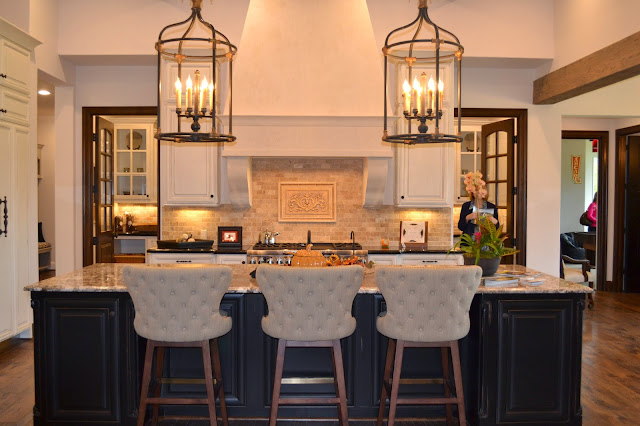
Open to the living area, is the stunning kitchen and dining area.  It's all perfect, the more you look around the more you fall in love with everything this space has to offer!  I have island envy, for sure!  A large island looks finished with properly scaled lighting - in this case, two large lantern style fixtures.  You could also go with three pendants if they were a bit smaller in size.  As long as the scale is appropriate for the room, bigger is better when it comes to lighting - let it make a statement
 
 
From this view, you wouldn't think there is enough cabinet storage, but this layout has lots of surprises and doesn't disappoint!  Notice the doors on the back wall?  We'll look inside in just a moment...
 
 
Love the hardware on the custom refrigerator doors!


This home has one dining space for casual and formal dining.  I've always loved this concept!  I see too many dining rooms going to waste.  I love to find ways to make these special areas function for families.  Square footage shouldn't just go to waste.  By having one dining room, you're sure to get a lot of use out of it!  I love round dining tables, and have one in my own home.  But if I lived here I think I'd prefer a large farmhouse dining table with seating for ten.  There's definitely enough room for it. :)
 
 
Okay, now to see what's behind those doors...
 
 
Yup!  That's a fully stocked kitchen in the form of a butlers pantry!  I died!  The owner of this beautiful home was actually present during the tour.  She told me that she loves to entertain, but doesn't want to keep the kitchen mess out while her company is over.  This hidden, but convenient butlers pantry is the perfect solution!     
 
 
Cabinets for days!  Don't you feel like one kitchen just isn't enough anymore? :)
 
 
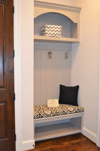
Just off of the kitchen are these functional spaces which are sure to get a lot of use.  The house is undeniably big, but there isn't any wasted space, it's all thoughtfully laid out.  There are two of these convenient spaces for bags, shoes and sweaters.
 
 
This amazing desk area could take the place of dedicating an entire room to a "study". 
Just the perfect spot for staying organized.
 
 
The laundry room has durable stone flooring and dove gray cabinets. 
 
 
And there's even a shower space for the pups!
 
 
The secondary bedrooms felt more like mini-master bedrooms - so beautiful!


I missed getting a photo of the other bedroom, probably because I was distracted by this gorgeous bathroom!


On the other side of the house is the master bedroom.  This beautiful vignette at the bedroom door is the perfect transition into this stunning suite.


AMAZING shower with a sky light!  Seriously, this thing is bigger than my closet!
 
 
Speaking of closets...don't you love the pale robins egg blue color on the custom shelves??
 
 
And the outdoor living spaces were just as lovely...


I could live happily in this beautiful barn!
 
 
All of the proceeds from this tour were donated to HomeAid Houston, and Operation Finally Home, who provides homes to veterans and veteran's widows.  Such an honorable cause, and I thought it was very generous of the homeowner to open her home in support of it.  I hope you enjoyed the tour as much as I did!
 
And, my sincere thanks, especially today, to all of the veterans who have served and sacrificed for our country!  God bless you!  
 
For more information on the builder of this home:
 
Beautifully designed and decorated by: